
One of the most difficult concepts for people picking up Copics for the first time is figuring out the strange code on the cap of each marker. This code serves as the starting point for basic blending, so understanding it is really the key to good coloring. I talk to plenty of people who start their collections by just picking out a bunch of colors they like and then wonder why none of them go together. You
The Copic color wheel is based on the Munsell Color System, which measures color on three dimensions. The coding system defines each Copic color in terms of those dimensions.
Hue – Simply refers to the color. Munsell identified 5 principal hues and 5 intermediate hues, represented by their initials. The first letter or 2-letter combination on a Copic marker refers to the Hue. They are:
R – Red
YR – Yellow Red (Orange)
Y – Yellow
YG – Yellow Green
G – Green
BG – Blue Green
B – Blue
BV – Blue Violet (Indigo)
V – Violet
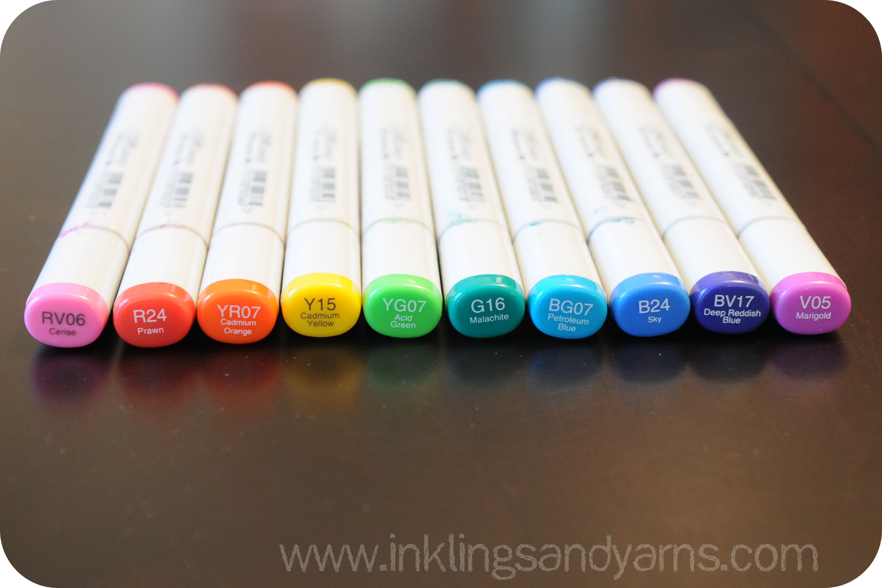
Here is an example of the Copic rainbow:

Value – In most basic terms, this is brightness of a color. More specifically, it’s the amount of black in the color. The first digit after the letter(s) on a Copic marker tells you it’s value. The scale goes from zero-nine, with zero’s having the least black (or most vibrance) and nines having the most black (or least vibrance).
Take a look at the reds below. I grabbed one of each with a different Value number (value value?) You’ll notice that (except for 85) none of them are really darker or lighter than each other, but as you move up the scale they go from bright, pure red to deep, grayish rose.

Chroma – Refers to how saturated a color is, or how much white is in it. The last digit in the Copic number tells you the chroma. Again, the scale goes from zero-nine. But here, zero represents the most white, while 9 represents the most saturated color.
Now check out these reds. They all have the same Value (2), so the only difference is saturation. They dye in each of these markers is exactly the same, it’s just different concentrations.

Confused yet? All you really need to take away from this is the concept of Blending Groups. These are groups of markers with matching Hue and Value, and differing Chroma.
Really, all you have to do is think in decades. Want a bright, fire-engine red? Use the R20s above. How about a deep, olive green? YG90s are good for that. Thinking of your markers in groups of ten will help you to look for those matching Hues and Values (the first two pieces of the code). Typically, you then want the Chroma numbers (the last digit of each code) to be separated by 2-3 digits. So the aforementioned fire-engine red would be accomplished with R22 (highlight), R24 (mid-tone) and R27 (shadow).
That’s it. Decades. So now, when you’re in the store facing that wall of colors, you’ll know that while R29, R35, and R81 are all pretty colors, putting them together isn’t going to get you too far. You’re better off choosing one and grabbing it a couple of buddies from its own blending group.