So, I have a bit of a new obsession. You already know my favorite stamps, and markers, and die cutter, and dies; but every good crafter needs a favorite paper.
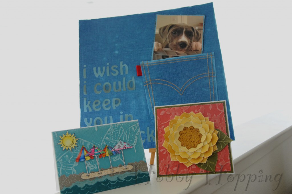
Core’dinations just might be it. It comes in dozens of fun, vibrant colors, and it has a complimentary colored core that you can reveal by embossing, sanding, distressing, tearing, etc. They even have pre-embossed designs that coordinate (hah!) with lines from Basic Grey, Jenni Bowlin, My Mind’s Eye, etc. AND they recently released a line of colors that matches Ranger’s Distress Ink and Adirondak lines. What more could you possibly need? I’ll tell you, because the thing I love most about Core’dinations paper is that it’s thick and sturdy enough to hold up to some major embellishing, but also soft enough that it cuts easily and can be crumpled without tearing. It’s hard to find a paper with all that. Believe me, I use a LOT of paper.
So I actually have a few projects today, because I just can’t get enough of this paper.
Project 1: Card Background
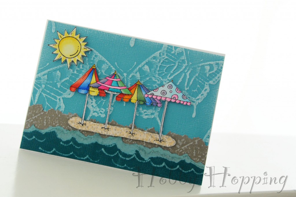
I layered 3 papers from 3 different collections to create a beach scene. Since the butterflies were already embossed into the Aquarium paper, all I had to do was rub over it with a medium-weight sanding block to reveal the pattern. The paper I used for the sand was embossed with a diamond pattern that had a great texture. I actually wanted to cover the entire sheet with that texture instead of just the diamonds, so I placed the paper face-down on a thin foam pad, and hit it repeatedly with the butt end of a thin paintbrush (any small, round-tipped implement will do). Then I sanded over that to reveal the stippled sand look. For the water, I used the same tool to “draw” waves on the back side of the Deep Lagoon Paper. That embossed the paper just enough for the waves to be revealed when I sanded.
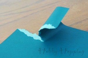
Also notice the way I tore the sand and the waves. I always tear my paper by holding one side flat on the table with my left hand, and pulling the other side away with my right. This causes the colored core to be revealed on left side. Since I wanted to reveal the core on my water, I held the paper face-up on my table. For the sand, I didn’t want to reveal the core, so I held it face down to ensure the core color would be in back.
 And of course, I had to finish the scene with some of my other favorites: Copics and Hambo Stamps. See how nicely they all play together? I love how the smooth, bright images contrast with the rough, distressed background.
Recipe:
Paper: Core’dinations Core Essentials Deep Lagoon; Core’dinations Graphic 45 Timeless Collection Diamonds in Cream of Wheat; Core’dinations Jenni Bowlin Studio Collection Vintage Brights Butterfly in Aquarium.
Images: Hambo Stamps Sun 3420 and Beach ‘Brellas 3408
Copics: Y11, 13, 15; R22, 24, 27; B00, 02, 21, 24, 28; BV00, 04, 08; RV02, 04, 06, 09; BG45, 49; G12, 14; V12, 15, 17; W0, 2, 4, E50, 51
Other: Medium grit sanding block, Pop Up Dots
Project 2: Scrapbook Layout
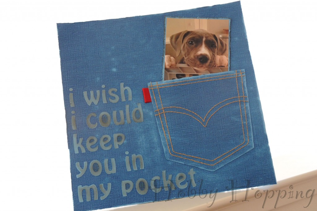
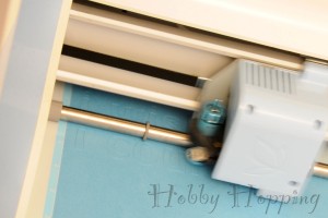
This project shows off how perfectly Core’dinations works with Pazzles. Remember when I said it’s sturdy, but still soft? That means it cuts like butter, but doesn’t curl or tear when you pull it off the cutting mat. For this reason, I will now be using Core’dinations for all of my Pazzling needs.
The inspiration for this layout actually came from the paper. The Vintage Collection has the color core already showing through to the surface of the paper, so the Oxford color looks like a pair of new jeans.
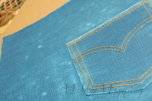
I designed and cut out the back pocket with my Pazzles, and used the paper piercing attachments to punch all the holes for the hand-stitching detail. I also punched the outer outline onto my background paper. That’s right, that pocket is actually hand-sewn to the background. Of course, before I did the sewing, I had to wear out my jeans a little. I used my sanding block and my Tim Holtz distressing tool all over the place to give the paper a softer, more worn look.
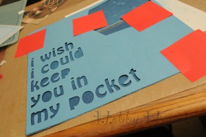
The title was also cut on my Pazzles, from the rear (lighter colored) side of the same paper. I had no idea how I was going to line all those letters up, until I had a brainstorm. I used the scrap that the letters were cut from as my template! Once again, Core’dinations’ ability to keep its shape when it’s peeled from the sticky cutting mat saved the day. I just positioned the negative over my layout, held it in place with Post-It Notes, and glued each letter in the space it came from. So easy!
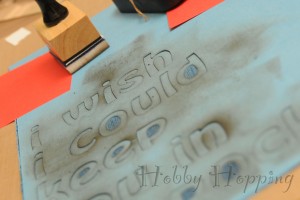
To add a little contrast, I rubbed on some Frayed Burlap Distress Ink over the lettering before I pulled up the template. Then, once the glue was dry and everything was good and stuck, I went over it once more with my sanding block to very lightly fray the edges of each letter.
I made this layout for Herbert because I really do wish I could keep her in my pocket. I like to say the reason is because she’s so adorable I just want to have her with me all the time. But the truth is that she’s such a trouble maker that I need to keep her in my sights all the time. I guess I’d be rebellious too if my fool owners gave me a boy’s name.
Recipe:
Paper: Core’dinations Vintage Collection Oxford
Ink: Distress Ink Frayed Burlap
Thread: DMC embroidery floss
Tools: Pazzles Inspiration, Medium grit sanding block, Quickie glue pen
Project 3: Flower Embellishment
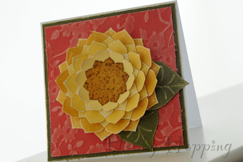
For my last project of the day, I wanted to show how great this paper is for making custom embellishments. I made this sunflower with 3 different shades of yellow Core Essentials, and the Spellbinders Nestabilities Blossoms 2 die set.
I cut two flowers in each of the largest three sizes, using my darkest color for the largest flowers and my lightest for the small. Then, using my darkest yellow again, I cut one blossom in the next lower size and set it aside.
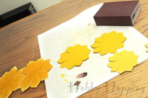
Next I snipped each flower to partially separate the petals. After that I lightly sanded both sides of each blossom, then I curled the petals on one blossom in each size. Here again the softness of this paper worked in my favor. The petals curl nicely without creasing, and they hold their shape.I stacked curled layers over flat layers to create a dimensional flower.
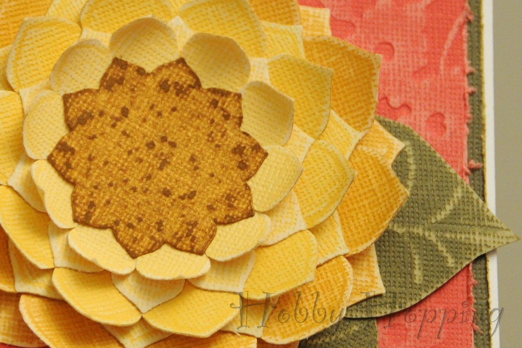
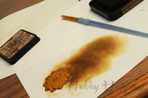
Remember that technique I used on the first card to make a pockmarked texture with a round-tipped tool? I did it again here to add texture to the center of my flower. After I sanded it I gave it a few coats of Brushed Corduroy Distress Ink. The exposed core is rougher than the surface of the paper, so it picks up more ink and making the sanded off specks darker instead of lighter. Neat trick, huh?
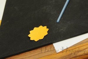
Finally, I finished the flower off with a couple of leaves. I cut them out freehand, “drew” the veins with the back of my paintbrush, and sanded them.
This embellishment is perfect for a card or scrapbook page. Or, you could attach it to a stick and place it in a decorative pot for a fun, summery decoration. I mounted it on a card using more Core’dinations, because I just couldn’t get enough.
Recipe:
Paper: Core’dinations Core Essentials Imperial, Dandelion, Buttercup, and Olive; Core’dinations Core Impressions Jenni Bowlin Studio Collection Vintage Brights Buttercup in Cardinal.
Die Cuts: Spellbinders Nestabilities Blossoms 2
Ink: Distress Ink Brushed Corduroy
Other: Sanding Block

And there you have it. Core’dinations cardstock helps you make fun, cute and easy crafts. What more could you want?
Disclaimer: Please note that I was not paid for this post. However, Core’dinations is holding a design team call, and I did make this post because I want in.

